PPC landing pages: How to craft a winning post-click experience
Ads get you traffic. Landing pages get you customers.
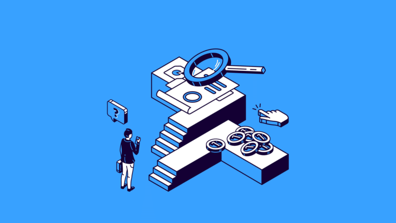
The post-click experience remains underrated in the grand scheme of PPC marketing.
Many advertisers focus so extensively on ad campaigns that they neglect the experience on their website or landing page – which is where a sale is made or a lead generated – and all the other touchpoints that follow.
To win new business and retain that hard-earned revenue, you must expand your scope to include what happens after ad clicks.
In this article, I’ll walk you through:
- My own tried-and-tested landing page philosophy.
- How to improve the lead-gen post-conversion experience.
- How to improve the ecommerce post-conversion experience.
- Why you should take the post-click experience seriously.
Most advertisers and agencies typically specialize in either ecommerce or lead-gen campaigns, but there’s a generous amount of knowledge crossover between the two.
At my agency, we were doing landing pages for ecommerce clients long before they became commonplace, as they are today. Because of my experience with lead-gen campaigns and seeing how impactful landers could be, we were able to learn from one discipline and apply it to the other.
That mentality is critical in today’s paid media landscape.
Here’s what I’ve learned about landing pages for both ecommerce and lead gen.
Keep designs responsive across devicesSmartphones accounted for 78% of B2C ecommerce traffic and 66% of orders as of Q4 2023. So before you do anything else with your landing pages, make sure they’re responsive across devices, with particular emphasis on mobile.
- Page elements should load quickly and be in the space you’ve assigned them. The longer a visitor has to wait, the more likely they are to leave.
- Copy, visuals, forms and other elements should render and work as intended. Buttons should be easy to press and spaced enough so that visitors don’t accidentally tap another element.
- Design and layout should look and feel natural to the smartphone form factor. Present all the key and primary information above the fold, including your call to action.
- Keep your navigation simple. A logo going to your website is fine, but no other links. The goal is to reduce clutter. Ask yourself if each element is truly needed.
Some landing page inspiration for your Monday:
– No navigation elements
– All necessary info above the fold
– CLEAR CTAs
– Small timer for urgency
Smooth, simple, and crushing for us
Test this structure with your next LP – there will be a clear winner. pic.twitter.com/KrGW4IHVAR
There are a handful of elements I like to focus on when building, testing or optimizing our landing pages:
- Headline and copy: Pick clear over clever every day of the week. State in very plain language what you do and for whom and match both your ad and keyword intent.
- Social proof: Display credibility above the fold. Customer reviews, links to review sites and media or industry accreditations build trust with visitors.
- Offer, form and call to action: Make forms prominent, easy to fill and only as many fields as needed. For call conversions, a clear CTA is a must with tracking.
You can (and should) include content below the fold so that as people scroll, they can learn more about the business, what it does, the solution and its benefits. Intersperse that with CTAs between sections.
While you might see incremental gains by testing those elements lower in the page, if your budget is limited or you have other constraints, you might probably achieve more by:
- Highlighting new pain points with your messaging.
- Testing different styles of images or visuals.
- Using clear social proof that calls out value immediately.
- Trying a new offer or positioning the same offer differently.
- Writing calls to action that make readers feel confident.
Nailing your landing page's first fold will make you money at will.
But many haven’t realized its full potential.
Standing out is easy if you understand:
• Visual Narrative
• You-Driven writing
• Cognitive conversion triggers
If I were Coursera, this is how I’d do… pic.twitter.com/PQPpJKZVrp
 (@eliasmas_tw) September 27, 2023
Approach copy and design with the right mindset
(@eliasmas_tw) September 27, 2023
Approach copy and design with the right mindset
When the text and visual elements of your landing page work together harmoniously, this typically reflects in campaign performance.
Clicking on an ad that interests you, being met with a visually exciting page, discovering that the product is what you wanted, reading through an offer that makes you feel understood as a customer – it’s tough to walk away from that if you have a genuine need for what’s being sold.
But if your team has to prioritize one skill over the other, pick copywriting.
Landing pages succeed all the time with simple yet functional design and outstanding messaging, but they rarely perform to satisfaction when they look stunning without much substance in the offer and message.
Just don’t neglect design, especially mobile responsiveness.
Deliver what the ad promised“What you see is what you get.” This should be your mantra when it comes to landing pages so that what people see in the ad is what they see on the landing page.
If you advertise for pest control but your landing page talks about repairing foundational damage from termites, it won’t convert well. Even though pest control is technically part of your offer, it doesn’t match the reason someone would click on the ad.
This is amplified in paid search, where your ad is shown mostly to people who are actively searching for what you’re selling or for related terms.
And as a customer, few things are as frustrating as clicking on an enticing ad, only to find out that what they wanted:
- Is out of stock.
- Costs more than advertised.
- Isn’t authentic or real.
- Will take too long for fulfillment.
- Doesn’t match what your page is selling.
Bonus Point: Your Landing Page
Did you turn off pop-ups? Does the landing page copy match your ads? What about your emails? Having a consistent tone gets lost by some brands.
This is the beggining, not the end. Let your brand's personality shine.
Don't use FB Lead Gen Ads 