Creating a Crypto Dashboard with Custom CSS in Streamlit
 An easy approach to truly harness the power of streamlit and create great-looking dashboards
Dashboards are a great way to represent any kind of data and it’s one such form to make great sense of the data we are dealing with. Building stunning dashboards using HTML, CSS, and JavaScript frameworks can be a very tricky job especially when you want to add complex functionalities and intricate designs to the dashboard. But fear not, Python’s here for your rescue.
With the introduction of a massive number of frameworks and libraries dedicated to web development, Python is becoming a favorite among web developers. Today, we will be using one such powerful framework called Streamlit to build our great-looking, professional crypto dashboard.
This article contains a lot of things like acquiring the crypto data using TAAPI.IO’s API endpoints, defining the dashboard layout, adding custom CSS to the dashboard, etc. So fasten your seatbelts for this exciting ride!
Acquiring the DataBefore starting to build the dashboard, it is essential to have a clear background on the data we are going to work with. Let’s start with importing the essential packages into our Python environment:
# IMPORTING PACKAGESimport streamlit as st
import requests
import pandas as pd
If you haven’t installed any of the imported packages, make sure to do so using the pip command in your terminal.
Now, we are going to pull the crypto data from one of the most reliable data providers in the market, TAAPI.IO. They offer both real-time and historical crypto as well as stock data API endpoints. Along with that, their unique and huge library of technical indicators API comes in handy for tasks like algo trading and much more. Make sure to create a TAAPI.IO account for the smooth execution of all the upcoming code.
In this article, our focus is only on two of their crypto APIs which are Real-Time Price API, and Historical Crypto Prices API. Starting off with the real-time API, here’s an example of using it in Python:
api_key = 'YOUR API KEY'btc_price = requests.get(f'https://api.taapi.io/price?secret={api_key}&exchange=binance&symbol=BTC/USDT&interval=1m').json()
btc_price
Pretty simple, right? Now, let’s analyze the API URL to understand more about the endpoint. It takes the API key, the exchange from which we are interested in getting the data, the crypto symbol, and the interval/timeframe of the data. Apart from these, there are a lot of additional parameters for further filtering the data which you can view in their documentation. The output is a JSON response that looks like this:
{'value': 33999.99}Another API that we’ll be using for our dashboard is the historical crypto data API which, as the name suggests, helps in obtaining historical data for a given cryptocurrency. The following code uses this API to extract Bitcoin’s historical data for the last one year:
api_key = 'YOUR API KEY'url = f'https://api.taapi.io/candles?secret={api_key}&exchange=binance&symbol=BTC/USDT&interval=1d&period=365'
hist_json = requests.get(url).json()
hist_df = pd.DataFrame(hist_json).drop('timestampHuman', axis = 1).rename(columns = {'timestamp':'time'})
hist_df.time = pd.to_datetime(hist_df.time, unit = 's')
hist_df.tail()
The code is pretty much the same except for some data manipulation tasks. The parameters of the API are very similar to those of the real-time API but one additional parameter we are adding here is the time period of the historical data (365 days in our case). This is the final output dataframe:
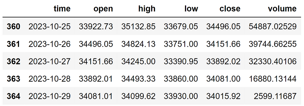 BTC Historical Data (Image by Author)
Awesome! Now that we have a good background on the two APIs we’re going to use to power the dashboard, let’s start with our actual work of building it.
Sketching the LayoutThis is one of the most overlooked steps but can be of incredible help and saves a ton of time. Having some sort of reference material for designing the dashboard exponentially boosts the development process. Here’s a rough sketch of the dashboard we’re going to build:
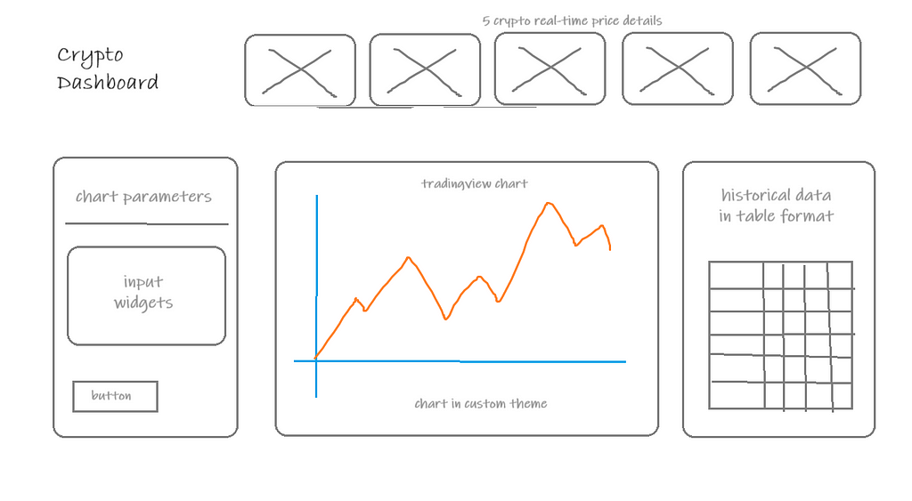 Dashboard Layout (Image by Author)
Nothing fancy here but just a plain, simple, and clean design. The header consists of the dashboard title along with five cards that reveal the real-time prices of five major crypto pairs.
As the body, we have three sections. The first is the chart parameters which contain streamlit widgets like selectbox and number input. The second section is dedicated to charting the historical data using a Python library for creating TradingView charts. The third and final section is for representing the historical data in table format.
Each part of the dashboard will be designed with custom CSS as Streamlit’s preset designs are too generic and basic. With that being said, let’s start building the dashboard in Streamlit.
Building Blocks: Creating Dashboard.py, style.css, config.tomlBefore jumping into building the streamlit app, it is highly recommended to keep things in place as it is a much more organized way of development.
To start off, create a Dashboard.py (name the file as you like) which will be the core file for running the streamlit app. This is the file where the actual building of the app undergoes.
Secondly, since we are going to build the app with custom CSS, it is mandatory to have a separate CSS file. You can name the file as you like but I prefer a more common naming convention, i.e., style.css. In this file, we will be customizing all the pre-defined streamlit CSS properties.
Finally, in order to change the theme of the streamlit app globally, we have to create a separate directory with the name of .streamlit inside which, we need to have a config.toml file. After creating the TOML file, copy and paste the following code to replicate the theme of the dashboard:
[theme]primaryColor="#2962ff"
backgroundColor="#131722"
secondaryBackgroundColor="#0c0e15"
textColor="#f6f6f6"
The theme is a blend of dark mode with some blues in it for a pleasant and soft-looking feel. You can customize the theme as per your wish.
Building the Dashboard HeaderLet’s take the final dashboard header as the reference material which will be easier for me to explain the development process.
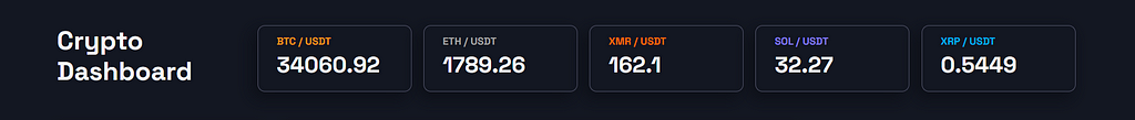 Dashboard Header (Image by Author)
After analyzing the header section, here’s the approach we can follow.
Development Approach:- Specify the layout of the streamlit app to be wide
- Creating seven columns with uneven spacing
- Use st.markdown for the dashboard title instead of st.header since the former allows custom fonts and CSS
- Use the real-time API with the timeframe as 1m to get live prices of the crypto pairs
- Use st.container and st.markdown to create the unique price cards
- Import custom font (Space Grotesk in our case) from Google Fonts
- Customize the pre-defined padding of the streamlit app
- Create a class for the dashboard title with custom font size, font weight, padding, and line height
- Customize the CSS of st.container to include custom border, border radius, padding, and box shadow.
- Create separate classes for each crypto pair title for unique colors.
- Create a separate class for showing the real-time price of the crypto pairs which stays the same for all the price cards.
The following two blocks of code implement the two approaches we discussed above to create the header section of the dashboard. The first code block is written in the Dashboard.py file and the second on style.css.
Dashboard.py:
import streamlit as stimport requests
import pandas as pd
from lightweight_charts.widgets import StreamlitChart
if "symbols_list" not in st.session_state:
st.session_state.symbols_list = None
st.set_page_config(
layout = 'wide',
page_title = 'Crypto Dashboard'
)
st.markdown(
"""
""", unsafe_allow_html = True
)
with open('style.css') as f:
st.markdown(f'', unsafe_allow_html = True)
api_key = 'YOUR TAAPI.IO API KEY'
title_col, emp_col, btc_col, eth_col, xmr_col, sol_col, xrp_col = st.columns([1,0.2,1,1,1,1,1])
with title_col:
st.markdown('
Crypto
Dashboard
with btc_col:
with st.container():
btc_price = requests.get(f'https://api.taapi.io/price?secret={api_key}&exchange=binance&symbol=BTC/USDT&interval=1m').json()['value']
st.markdown(f'
BTC / USDT
{btc_price}
', unsafe_allow_html = True)with eth_col:
with st.container():
eth_price = requests.get(f'https://api.taapi.io/price?secret={api_key}&exchange=binance&symbol=ETH/USDT&interval=1m').json()['value']
st.markdown(f'
ETH / USDT
{eth_price}
', unsafe_allow_html = True)with xmr_col:
with st.container():
xmr_price = requests.get(f'https://api.taapi.io/price?secret={api_key}&exchange=binance&symbol=XMR/USDT&interval=1m').json()['value']
st.markdown(f'
XMR / USDT
{xmr_price}
', unsafe_allow_html = True)with sol_col:
with st.container():
sol_price = requests.get(f'https://api.taapi.io/price?secret={api_key}&exchange=binance&symbol=SOL/USDT&interval=1m').json()['value']
st.markdown(f'
SOL / USDT
{sol_price}
', unsafe_allow_html = True)with xrp_col:
with st.container():
xrp_price = requests.get(f'https://api.taapi.io/price?secret={api_key}&exchange=binance&symbol=XRP/USDT&interval=1m').json()['value']
st.markdown(f'
XRP / USDT
{xrp_price}
', unsafe_allow_html = True)style.css:
@import url('https://fonts.googleapis.com/css2?family=Space+Grotesk:wght@300;400;500;600;700&display=swap');/* DASHBOARD PADDING */
div.block-container.css-z5fcl4.egzxvld4 {
width: 100%;
min-width: auto;
max-width: initial;
padding-left: 5rem;
padding-right: 5rem;
padding-top: 15px;
padding-bottom: 40px;
}
/* GLOBAL FONT CHANGE */
html, body, [class*="css"] {
font-family: 'Space Grotesk';
}
.st-ae {
font-family: 'Space Grotesk';
}
/* CONTAINER CSS */
[data-testid="stVerticalBlock"] > [style*="flex-direction: column;"] > [data-testid="stVerticalBlock"] {
border: 1px groove #52546a;
border-radius: 10px;
padding-left: 25px;
padding-top: 10px;
padding-bottom: 10px;
box-shadow: -6px 8px 20px 1px #00000052;
}
/* CUSTOM MARKDOWN CLASSES */
.dashboard_title {
font-size: 35px;
font-family: 'Space Grotesk';
font-weight: 700;
line-height: 1.2;
text-align: left;
padding-bottom: 35px;
}
.price_details {
font-size: 30px;
font-family: 'Space Grotesk';
color: #f6f6f6;
font-weight: 900;
text-align: left;
line-height: 1;
padding-bottom: 10px;
}
.btc_text {
font-size: 14px;
font-family: 'Space Grotesk';
color: #f7931a;
font-weight: bold;
text-align: left;
line-height: 0.2;
padding-top: 10px;
}
.eth_text {
font-size: 14px;
font-family: 'Space Grotesk';
color: #a1a1a1;
font-weight: bold;
text-align: left;
line-height: 0.2;
padding-top: 10px;
}
.xmr_text {
font-size: 14px;
font-family: 'Space Grotesk';
color: #ff6b08;
font-weight: bold;
text-align: left;
line-height: 0.2;
padding-top: 10px;
}
.sol_text {
font-size: 14px;
font-family: 'Space Grotesk';
color: #807af4;
font-weight: bold;
text-align: left;
line-height: 0.2;
padding-top: 10px;
}
.xrp_text {
font-size: 14px;
font-family: 'Space Grotesk';
color: #01acf1;
font-weight: bold;
text-align: left;
line-height: 0.2;
padding-top: 10px;
}
In the Dashboard.py, make sure to replace YOUR TAAPI.IO API KEY with your secret API key. In both files, there will be some stuff that goes beyond what we discussed in the development and styling approaches, but I’m not going to delve into the details as it will take a long time to explain them.
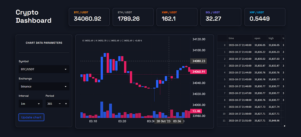
Building the Dashboard BodySimilar to what we did in the previous section, we’ll take the final output as the reference material to lay out the development and styling approaches. The following image is the final result of the dashboard’s body which we’re trying to build:
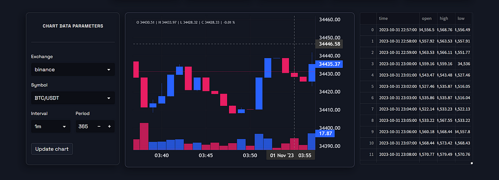 Dashboard Body (Image by Author)Development Approach:
- Create three columns with unique spacing
- Use st.form to create the parameters section
- Create a container for accommodating the chart
- Use the lightweight_charts library to create the interactive TradingView chart
- Use st.dataframe to show the extracted historical data
- Customize the CSS of st.container as well as st.form to include border, border radius, and box shadow.
- Create a custom markdown class for the title of the parameters form.
- Change the font of the widget labels and input text from the default Streamlit font to Space Grotesk
- Customize the CSS of st.button to change the border radius and font.
- Customize the theme of the TradingView chart to match the theme of the dashboard
The following two blocks of code implement the two approaches we discussed above to create the body section of the dashboard. The first code block is written in the Dashboard.py file and the second on style.css.
Dashboard.py:
params_col, chart_col, data_col = st.columns([0.5,1.2,0.6])with params_col:
with st.form(key = 'params_form'):
st.markdown(f'
CHART DATA PARAMETERS', unsafe_allow_html = True)
st.divider()
exchanges = ['binance', 'bitstamp', 'binancefutures', 'whitebit', 'bybit', 'gatetio', 'coinbase', 'binanceus', 'kraken']
exchange = st.selectbox('Exchange', exchanges, key = 'exchange_selectbox')
if st.session_state.symbols_list == None:
symbols = []
for i in exchanges:
symbols_list = requests.get(f'https://api.taapi.io/exchange-symbols?secret={api_key}&exchange={i}').json()
symbols.extend(symbols_list)
symbol = st.selectbox('Symbol', symbols, key = 'symbol_selectbox')
st.session_state.symbols_list = symbols
else:
symbol = st.selectbox('Symbol', st.session_state.symbols_list, key = 'symbol_selectbox')
interval_col, period_col = st.columns(2)
with interval_col:
interval = st.selectbox('Interval', ['1m', '5m', '15m', '30m', '1h', '2h', '4h', '12h', '1d'], key = 'interval_selectbox')
with period_col:
period = st.number_input('Period', min_value = 10, max_value = 500, value = 365, step = 1, key = 'period_no_input')
st.markdown('')
update_chart = st.form_submit_button('Update chart')
st.markdown('')
if update_chart:
url = f'https://api.taapi.io/candles?secret={api_key}&exchange={exchange}&symbol={symbol}&interval={interval}&period={period}&results=max'
hist_json = requests.get(url).json()
hist_df = pd.DataFrame(hist_json).drop('timestampHuman', axis = 1).rename(columns = {'timestamp':'time'})
hist_df.time = pd.to_datetime(hist_df.time, unit = 's')
with chart_col:
with st.container():
chart = StreamlitChart(height = 450, width = 650)
chart.grid(vert_enabled = True, horz_enabled = True)
chart.layout(background_color='#131722', font_family='Trebuchet MS', font_size = 16)
chart.candle_style(up_color='#2962ff', down_color='#e91e63',
border_up_color='#2962ffcb', border_down_color='#e91e63cb',
wick_up_color='#2962ffcb', wick_down_color='#e91e63cb')
chart.volume_config(up_color='#2962ffcb', down_color='#e91e63cb')
chart.legend(visible = True, font_family = 'Trebuchet MS', ohlc = True, percent = True)
chart.set(hist_df)
chart.load()
with data_col:
st.dataframe(hist_df, height = 470)
style.css:
/* FORM CSS */[data-testid="stForm"] {
position: relative;
box-shadow: -6px 8px 20px 1px #00000052;
border-radius: 10px;
}
That’s it! You’ve built yourself an amazing dashboard from scratch. This is the final result of our work:
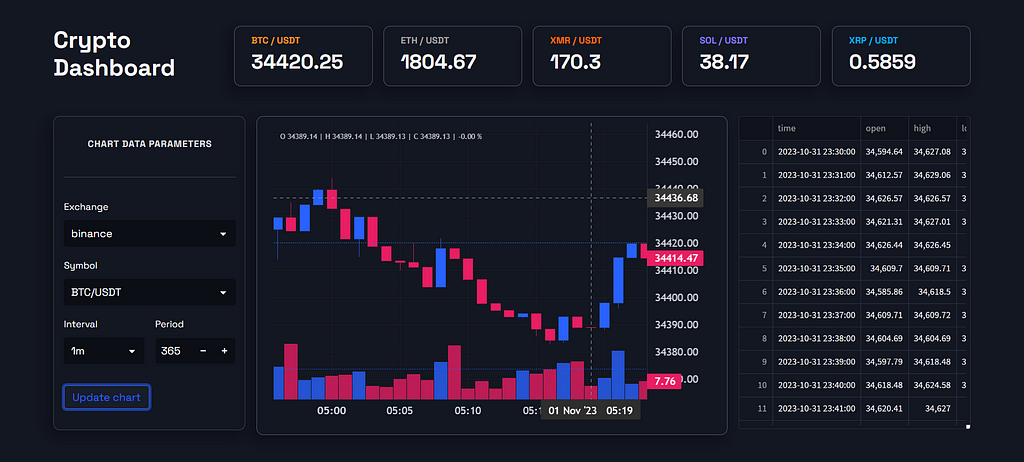 Final Dashboard (Image by Author)Final Thoughts
In this article, we went through an extensive process of building a crypto dashboard using Streamlit. We started off by exploring the data we were going to deal with, then we sketched the layout for the dashboard, and after that, we went on to build the dashboard with Streamlit using custom CSS in Python.
Though it was kinda tricky at several places, I personally enjoyed the whole process thoroughly. And thanks to TAAPI.IO’s API endpoints which made the development process less hectic.
This article is just a glimpse of the potential of Streamlit and Python’s growing dominance in the web development space. What could be done only with frameworks like React can also be accomplished using Python nowadays. With that being said, you’ve reached the end of the article. Hope you learned something new and useful. Thanks for your time.
Creating a Crypto Dashboard with Custom CSS in Streamlit was originally published in Coinmonks on Medium, where people are continuing the conversation by highlighting and responding to this story.