Crypto doesn’t have to look like this (either)
Why it needs a new language and a new face
 A sea of sameness
Scroll through ten crypto websites.
Dark and muted backgrounds. Neon edges. Orbital animations.
Futuristic terminals. Geometric grids. A looming void.
It’s less a vision of progress, more a moodboard for a digital apocalypse.
Crypto, for all its claims of revolution, feels strangely uniform.
Like everyone copied the same sci-fi trailer and swapped the logo.
This is the brand of an industry obsessed with the future —
but terrified of making it feel human.
For non-members, you can read the full story here.
Design without peopleWhy does so much of Web3 look like it was built for machines?
Why is every landing page a black box?
Why do the humans never show up?
The visual language is cold. Unfeeling. Abstract.
It signals complexity, but also distance.
Alienation disguised as sophistication.
In trying to appear credible, crypto forgot how to be relatable.
Compare it with the early internet: full of faces, quirks, colour, chaos.
Web3? It’s grayscale by default.
The same problem spills into copy.
We don’t get mission.
We get middleware.
We don’t hear why it matters.
We hear how it runs.
“Zero-knowledge rollups.”
“Modular consensus layers.”
“Token-curated registries.”
All accurate. All inert.
Crypto doesn’t lack intelligence.
It lacks interpretation.
If you can’t explain it without a deck,
you haven’t finished building it yet.
Five brand strategies for a more human Web3
1. Lead with purpose, not protocolWrong way:
We’re a zk-rollup solution leveraging modular data availability.Right way:
We help people move value freely, securely, and without gatekeepers.Start with the why, not the how.
Let the tech support the story, not replace it.
Dark mode is sleek. But it’s overdone.
It signals power, not warmth. Progress, not trust.
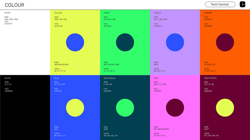 Colour palettes for Tech Central. Source: BrandNew.
Reintroduce vivid tones: electric mint, citrus, cobalt, sunlit peach
Balance geometry with organic form.
Make it feel alive again.
Crypto copy is often written to impress engineers, not invite humans.
 Tone of voice for Time. Source: Behance.
Strip it down.
Speak plainly.
Use metaphor. Use rhythm. Use warmth.
Less “revolution,” more relief.
4. Show humans, not just hubsMost crypto imagery looks like a render farm exploded.
Show people.
Show community.
Show what this is for.
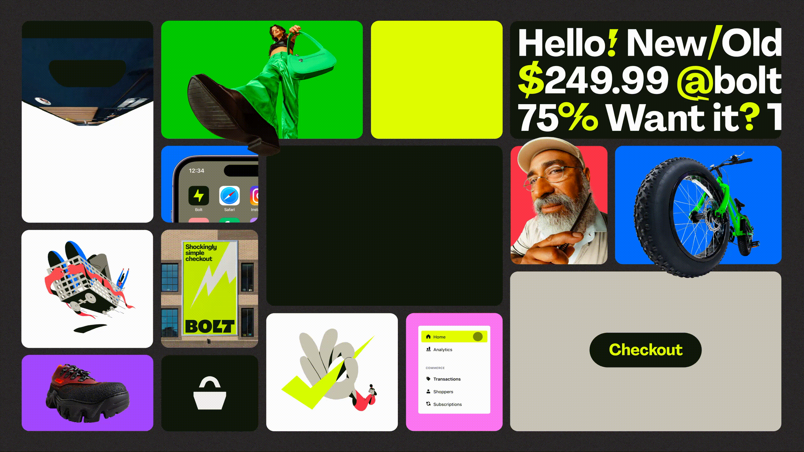 Rebrand for Bolt. Source: Jason Rosenberg.
Branding that doesn’t include the user isn’t branding.
It’s cosplay.
Web3 is messy. Experimental. Open.
So stop pretending everything’s polished.
Let people build with you.
Show what’s broken and what’s next.
Use transparency as a form of design.
Are you building a castle?
Or a campfire people can gather around?
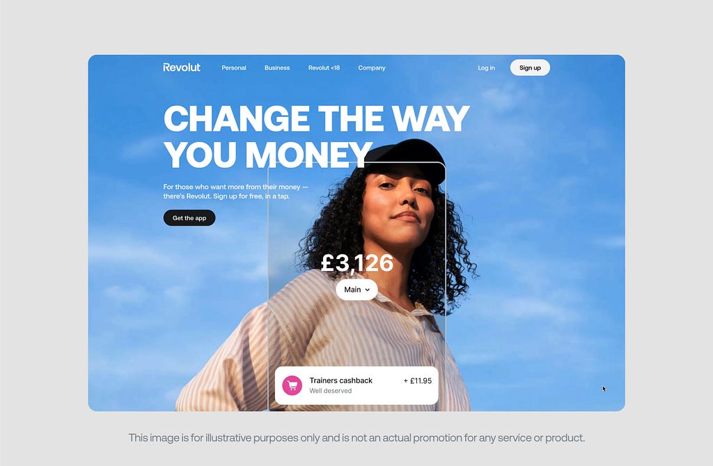 Revolut homepage. Source: Revolut.
It’s not a Web3-native brand but it’s one the space should study closely.
In its latest brand refresh, Revolut moved away from dark, hyper-digital aesthetics and leaned into something surprisingly rare in fintech — feeling.
The design system introduced fresh, expressive colour palettes.
 Source: Fintech Branding Studio
It embraced human photography , not just users, but people in motion, in thought, in life.
 Source: Fintech Branding Studio
The typography? Modern, yes. But with warmth.
This wasn’t about dumbing down.
It was about opening up.
Revolut doesn’t just show what the product does.
It shows who it’s for.
Yes, the visuals could be more forward-looking. Futuristic, even.
But the human truth is in how the brand makes you feel.
Not technical. Not elite. But invited.
Crypto could take notes.
Final thoughtThe real revolution won’t come from another decked-out Dapp site in black and chrome.
It’ll come from something, or someone that speaks plainly, looks alive, and makes you feel like you belong there.
Because no one ever adopted a future they couldn’t imagine themselves living in.
I’ve wrote a sequel to this. You can read it here.
References:
Cointelegraph: https://cointelegraph.com/innovation-circle/why-brand-consistency-matters-and-how-web3-companies-are-failing-to-deliver
Fast Company: https://www.fastcompany.com/90802524/why-human-centered-design-is-so-important-in-a-post-pandemic-world
FinTechBranding: https://fintechbranding.studio/revolut-brand-refresh
Huge Partners: https://medium.com/@Huge_Partners/web3-the-good-the-bad-and-the-ugly-a7b1b28e79ae
Mariam Rasoulzade: https://mariamrasoulzade.medium.com/color-psychol-how-blue-and-green-influence-trust-in-financial-apps-ogy-in-fintech-building-trust-1d77c0a7c351
The future doesn’t have to look like this was originally published in Coinmonks on Medium, where people are continuing the conversation by highlighting and responding to this story.